These changelog examples are great for getting inspiration on how to format your changelog and what to write in your release notes.
A changelog is one of the most underutilized pages in any SaaS product. Done right, it builds trust, drives feature adoption, reduces churn, and turns passive users into active advocates. Done poorly—or not at all—it signals that your product is stagnant and your team doesn't communicate.
We've spent a lot of time studying how software companies announce product updates. These 15 changelog examples represent the best of what's out there: strong writing, smart formatting, and genuine product-to-user communication. For each one, we go beyond surface-level observations to give you real, actionable insights you can apply immediately.
If you're still deciding how to structure your changelog before looking at examples, read our guide on changelog formatting best practices first. And if you're looking for the right tool to publish yours, check out our roundup of free changelog tools.
15 great changelog examples
Check out these examples of changelog hubs and individual entries to help you know what to write and how to format it.
1. Frill
We use our own product to manage our changelog, and we think that's worth talking about, because it forces us to hold ourselves to the same standards we set for everyone else.
Our changelog lives inside an embeddable widget that slides out from the right side of the screen when users click "What's new." The most recent release note appears immediately, without requiring users to navigate anywhere or leave what they're doing. When they want the full history, one click takes them to the complete changelog in reverse chronological order. The widget shows the most recent in our changelog.

What you can learn from this example
The most underrated feature in any changelog tool is emoji reactions. On the surface, they seem lightweight. In practice, they're a low-friction way to measure which updates actually resonate. If you publish 10 entries and one gets three times the reactions of the others, that's a signal about where your users find value, and where to focus next. Don't treat your changelog as a one-way broadcast. Use it to gather signal.
Embedding your changelog widget directly inside your web app is more valuable than linking to a standalone page. Users who are already logged in and actively engaged are the ones most likely to care about your updates. Meet them where they are.
Finally, if you're managing a public roadmap alongside your changelog, keep them in the same place. Separating them forces users to context-switch and breaks the story of your product's evolution. Frill houses Ideas, Roadmap, and Announcements all under one subdomain for exactly this reason.
2. Acadle
Acadle is a white-label LMS built for course creators and companies managing online learning programs. Their changelog is updated consistently across all types of releases: new features, integrations, bug fixes, improvements, and security updates. What sets it apart is how they've treated the changelog as a teaching channel, not just a release log.
Most of their entries include a short video alongside the written description. The videos don't need to be long. A 60- to 90-second walkthrough is enough to show a user how to access a new feature and why it matters. This approach respects that some of your users learn better by watching than by reading, and it dramatically increases the likelihood that users will actually adopt a new feature after seeing it in the changelog.
Worth noting: Acadle's changelog is itself built with Frill, a nice real-world example of how the platform looks in production for an LMS audience.

What you can learn from this example
Video is probably the most underused format in changelogs. Product teams are often stretched thin, which makes video feel expensive, but a simple screen recording with narration takes about the same time to produce as writing a detailed description. And it's often clearer.
Don't use video for every update. Reserve it for features that involve multi-step workflows or UI changes that are hard to communicate in static text. A quick "here's how it works" walkthrough does more for feature adoption than three paragraphs of explanation.
The design principle from Acadle is also worth noting: clean layouts with generous whitespace. Changelog entries often contain dense information like version numbers, technical details, multiple sub-features. If your design is cramped, users will skim past without absorbing anything. Simplicity isn't just aesthetic; it's functional.
3. Gorgias
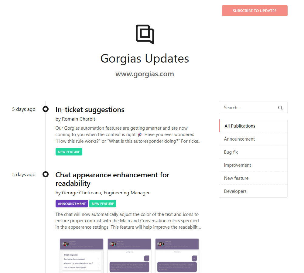
Gorgias is a customer service platform built for ecommerce. Their changelog is one of the most frequently updated we've seen with 8 to 10 entries per month. This signals something important: they're committed to continuous, visible improvement.
Rather than showing a static date, their changelog displays how long ago each entry was published (e.g., "3 days ago," "2 weeks ago"). This subtle choice makes the changelog feel alive. Users don't see a calendar date and do math. They immediately understand recency.
Their entry titles follow a reliable pattern: they identify what changed, what type of change it is, and why. An example: "Chat appearance enhancement for readability." That title covers the surface (chat appearance), the nature of the change (enhancement), and the purpose (readability). Every word earns its place.
What you can learn from this example
Consistency of publishing matters more than most teams realize. A changelog that hasn't been updated in six weeks implies an inactive product, even if your team has been shipping furiously in the background. Frequent, smaller entries are better for user perception than infrequent, comprehensive round-ups.
Category tags are a simple way to give users control over what they read. Gorgias uses New Feature, Improvement, Bug Fix, Announcement, and Developers. A developer who wants to track API changes shouldn't have to scroll past UX improvements. Let users filter to what's relevant to them.
If you're not sure how to title your changelog entries, use the Gorgias formula as a template: [surface area] + [type of change] + [reason/outcome]. It's almost impossible to write a bad title with that structure.
4. Asana
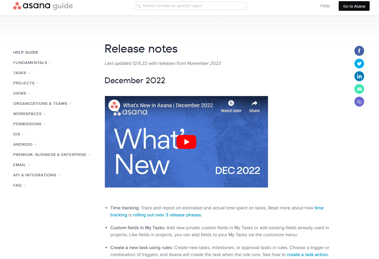
Asana publishes one changelog entry per month, bundling all releases from that period into a single comprehensive note. This is a common approach for larger product teams who prefer to communicate in planned cycles rather than on an ad hoc basis.
Their monthly entries work because they follow a rigid internal structure: each update within the entry has a bolded title, a short description, and clear visual separation. Users can scan the entry in 30 seconds and get a full picture of what shipped. They also produce one accompanying video per month, highlighting the three or four most significant releases with brief walkthroughs.
What you can learn from this example
If you're going to use the monthly round-up format, you have to commit to scannability. Bold, descriptive sub-headers are non-negotiable. A long changelog entry with no internal structure is one of the fastest ways to lose readers.
The one-video-per-month approach is smart for teams with limited production bandwidth. Rather than creating a video for every release, focus that resource on the highest-impact update of the month. Summarize the rest in text. This keeps production manageable without sacrificing quality.
One pattern worth replicating from Asana: linking directly to your product help documentation within changelog entries. When you announce a new feature, link to the support article that explains how to use it. This reduces the friction between "awareness" and "adoption," which is where most product updates stall.
5. Shopify
Shopify's changelog is a masterclass in information density done right. Every entry is published individually (not bundled into monthly round-ups), appears in reverse chronological order with clear dates, and includes two distinct tag systems that make the log infinitely more navigable.
The first tag identifies the type of entry (improvement, feature update, or new feature), rendered with a colored background for quick visual scanning. The second set of tags identifies the product area, like admin, apps, online store, analytics, discounts, shipping, shown in small text with no background. These two dimensions let users filter by what matters to them without the entry itself becoming cluttered.
Each entry in the main changelog view also shows a short description, enough to understand the update without clicking through. This is a detail that's easy to overlook, but it significantly improves the quality of the browsing experience.

What you can learn from this example
Two-dimensional tagging is a pattern more changelogs should adopt. Type tags tell you what kind of change this is. Area tags tell you where in the product the change lives. Together, they create a filtering system that serves wildly different types of readers without requiring any architectural complexity.
Preview descriptions in the main changelog view reduce the cognitive cost of deciding what to read. Users shouldn't have to open an entry to determine if it's relevant to them. A two-sentence preview handles this efficiently.
The per-entry publishing strategy (versus monthly round-ups) also has a distribution advantage: each entry can be promoted individually via email or in-app notification, letting you amplify your most important releases with targeted communication rather than burying them in a monthly digest.
6. Kit
Kit's changelog is designed for a specific audience, which is content creators, indie business owners, and freelance marketers. This shows in every decision. The writing is jargon-free. The format is visual-first. And the product area integration is seamless: users can navigate between the changelog and the public roadmap within the same subdomain.
Their signature move is the animated GIF. Every changelog entry opens with a GIF that demonstrates the feature in action. There's no reading required. You understand the update in three to five seconds. For a product that's centered on workflows (automations, email sequences, landing pages), this format is perfectly matched to how their users think.

What you can learn from this example
Audience-first writing is one of the most important decisions you can make for your changelog. If your users don't use technical language, neither should your changelog. If they think in terms of goals rather than features ("I want to grow my list" vs. "improved subscriber segmentation logic"), your changelog titles should reflect that framing.
GIFs have a real advantage over static screenshots: they show process, not just state. For any feature that involves multiple steps, setting up a workflow, configuring an integration, or navigating a new UI, a looping GIF communicates more than any screenshot could.
Connecting your changelog to your roadmap within the same interface closes the feedback loop for users. They can see what was just shipped, vote on what comes next, and trace the relationship between their input and your output. That's a powerful trust-building structure that very few products have nailed. If you use Frill, you can house your changelog, roadmap, and feature idea submission all in one place.
7. Calendly API
Calendly's API changelog is the opposite of most entries on this list, and that's intentional. It's minimal, technical, and written for exactly one audience: developers integrating with their API. Entries are short (two to four sentences), organized by month, and free of marketing language.
What makes this work is audience clarity. The developers reading this changelog are not looking for inspiration or product discovery. They're looking for specific information about what changed and whether it will break anything they've built. Calendly respects their time by getting to the point immediately.

What you can learn from this example
Not every changelog needs to be a marketing document. If your changelog is for a developer audience—especially an API or SDK—skip the narrative framing and get to the technical facts. What changed? What does it affect? What do developers need to do?
Monthly nesting (grouping entries under a collapsible month header) works particularly well for technical changelogs where the reader is often searching for a specific change from a specific time period, rather than browsing. It creates a lightweight archive structure without requiring complex taxonomy.
The broader lesson here is that your changelog format should follow your audience's use case, not industry convention. If your users are highly technical and time-pressured, ruthless brevity is a feature.
8. Freshbooks
FreshBooks takes an unconventional approach to changelog formatting: they use a table. Each row has three columns: category, update title, and description. It's clean, scannable, and immediately tells users how to navigate the information.
They also include a "Coming Soon" section at the top of the page, giving users visibility into what's planned before it ships. This creates a natural bridge between the changelog and the roadmap, without requiring users to visit a separate page.

What you can learn from this example
Tabular formatting is particularly effective for products that ship many small updates in parallel like bug fixes, micro-improvements, minor UI tweaks. Rather than creating individual entries for each, a table lets you communicate a dozen updates in the space a paragraph would occupy. The category column handles filtering at a glance.
The "Coming Soon" section is undervalued as a retention tool. Users who see that a feature they care about is on the horizon are less likely to churn in the meantime. It's also an implicit signal that the team is organized and forward-thinking, which matters for trust. But if you're managing this with Frill, you get Announcements, Ideas, and Roadmap all in the top menu navigation of your changelog subdomain, a more scalable version of the same concept.
One caveat: if your team ships frequently, a table can become very long very quickly. Consider pagination or a date range filter if you go this route.
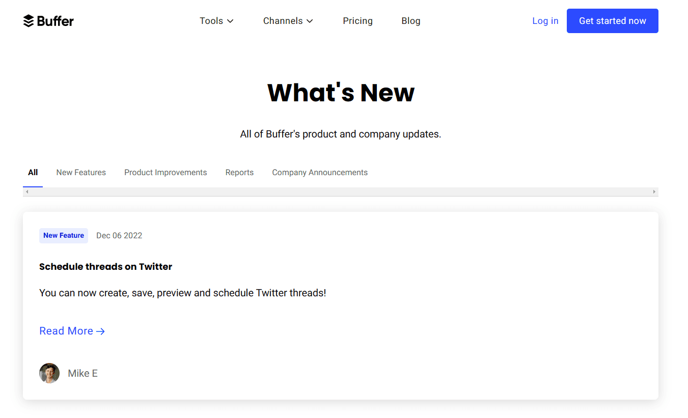
9. Buffer
Buffer's changelog is consistently cited as an example of excellent title writing, and it deserves the reputation. Every entry headline is an action: "Schedule threads on Twitter," "Export reports to PDF," "Save ideas for later." There's no passive voice, no feature name as title, no vague noun phrases. Just a clear statement of what the user can now do.
This framing reflects a fundamental understanding of what users actually care about: not what changed in the code, but what they can achieve because of that change. The distinction sounds subtle but the difference in engagement is significant.
What you can learn from this example
If there's one habit to develop for changelog writing, it's this: write titles from the user's perspective, not the developer's. Instead of "Improved threading API support," write "Schedule threads on Twitter." The feature is the same. The user's relationship to it is completely different.
Buffer also uses their changelog entries as lightweight teases, with short descriptions that link out to tutorials, feature pages, or blog posts for users who want the full picture. This is smart distribution: the changelog becomes a hub that routes users to deeper content, rather than trying to contain everything itself.
The resource-linking pattern is worth building into your standard workflow. Every time you publish a changelog entry for a significant new feature, link to the corresponding help article. Every time you ship something that changes a familiar workflow, link to the updated documentation. This reduces support volume and builds a more self-sufficient user base.
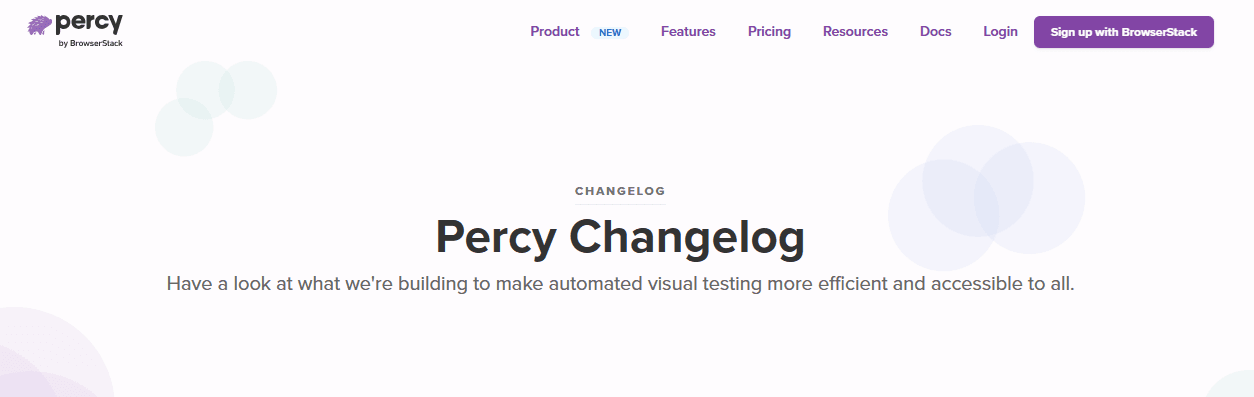
10. Percy
Percy (automated visual testing, now part of BrowserStack) uses its changelog as a showcase for its product philosophy: systematic, thorough, and designed to catch things users would otherwise miss. Their entries typically lead with a cover image or screenshot that immediately shows the change, followed by bullet-point highlights that let users assess relevance in seconds.
What distinguishes Percy's approach is the story each entry tells. Rather than cataloging what changed, each entry explains the problem the update was solving and why it matters for teams doing visual regression testing. That context transforms a list of changes into a narrative of product evolution.
At the top of their changelog, Percy includes a mission headline: "Have a look at what we're building to make automated visual testing more efficient and accessible to all." This framing reminds visitors why the product exists, a subtle but effective trust signal.

What you can learn from this example
A cover image for each changelog entry does double duty: it breaks up the visual monotony of a text-heavy feed, and it lets users immediately pattern-match whether the update is relevant to them. Screenshot of the UI → I can see what changed. Diagram of a new workflow → I understand the structure before reading.
The story-first format—leading with why before what—is more work to write, but it dramatically increases the likelihood that users will read the full entry and act on it. Technical users especially appreciate understanding the reasoning behind a change, not just the change itself.
One structural tip from Percy: if your changelog entry covers a single, significant update, write it like a short blog post (200–400 words), not a bullet list. Save bullet points for monthly round-ups or entries that cover multiple minor improvements.
11. Toby

Toby is a browser-based page organization tool that breaks most changelog conventions, and does it deliberately. Their entries are short, technical, and formatted like a commit log. No images, no narrative, no marketing language. Just what changed and whether it was a bug fix or an improvement.
For most products, we'd call this a mistake. For Toby, it works because of who reads it: highly technical users who are specifically looking for confirmation that a bug was fixed, not a guided tour of new features.
What you can learn from this example
Before designing your changelog, ask: who actually reads this, and what are they looking for? If the answer is "technical power users checking whether a known issue was resolved," a minimal format is the right choice. If the answer is "everyday users who might not realize new features exist," you need a lot more hand-holding.
Short, specific titles are the one universal, whether your changelog is technical or consumer-facing. "Fixed crash on import when file contains empty rows" is more useful than "Stability improvements" for any audience.
Including your changelog in your helpdesk (rather than as a standalone page) also makes sense for technical products where users are already in a support mindset when they encounter it.
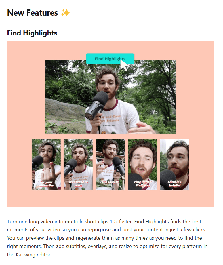
12. Kapwing
Kapwing is an AI-powered video editing platform with a deep feature set. Their monthly changelog entries follow a disciplined structure: New Features first, then Bug Fixes & Improvements. Each section uses clear imagery, usually screenshots or short animations, to demonstrate the update visually.
The consistent structure is key. Users who visit Kapwing's changelog regularly develop a mental model of how to read it. They know where to look for new capabilities versus fixes. That reliability reduces friction and increases return visits.
What you can learn from this example
If you use the monthly round-up format, invest in a consistent template and stick to it. Your readers will thank you. The section order (new features before fixes) is a deliberate editorial choice: it leads with excitement and progress before addressing problems.
Use your changelog to promote features that deserve attention, not just to acknowledge everything that shipped. If a new feature is genuinely powerful, give it a dedicated section with a visual demonstration. Don't bury your flagship releases alongside minor fixes.
The Kapwing approach also reflects a useful production rhythm: once a month, the team takes stock of what shipped, writes the entry, gathers visuals, and publishes. For teams without a dedicated technical writer, this cadence is sustainable in a way that "publish on every release" often isn't.
13. Intercom
Intercom's changelog does something most don't: it uses entries as a recruitment channel for beta testers. When a major feature is in early access, their changelog entry explains what it is, what problem it solves, and how to get access. The CTA is direct and specific, not "learn more," but something tied to the action they want users to take.
This approach serves multiple goals simultaneously. It generates buzz for upcoming features. It recruits real users for beta testing. And it gives users a sense of involvement in the product's development, which strengthens their connection to the product.

What you can learn from this example
Your changelog is a distribution channel, not just documentation. Think about what actions you want users to take after reading each entry. For a new feature, the action might be "try this now." For a beta, it might be "apply to join." For an integration, it might be "connect your account." Write a custom CTA button copy for important entries where you want users to take action, not a generic "read more."
Intercom's visual style, illustrated cover images with icons and clean typography, also makes each entry feel designed, not just written. This matters for brand perception. A visually consistent changelog communicates craft, and craft signals quality. Always put all of the important details in the description so users can understand the announcement without having to click through unless they want to.
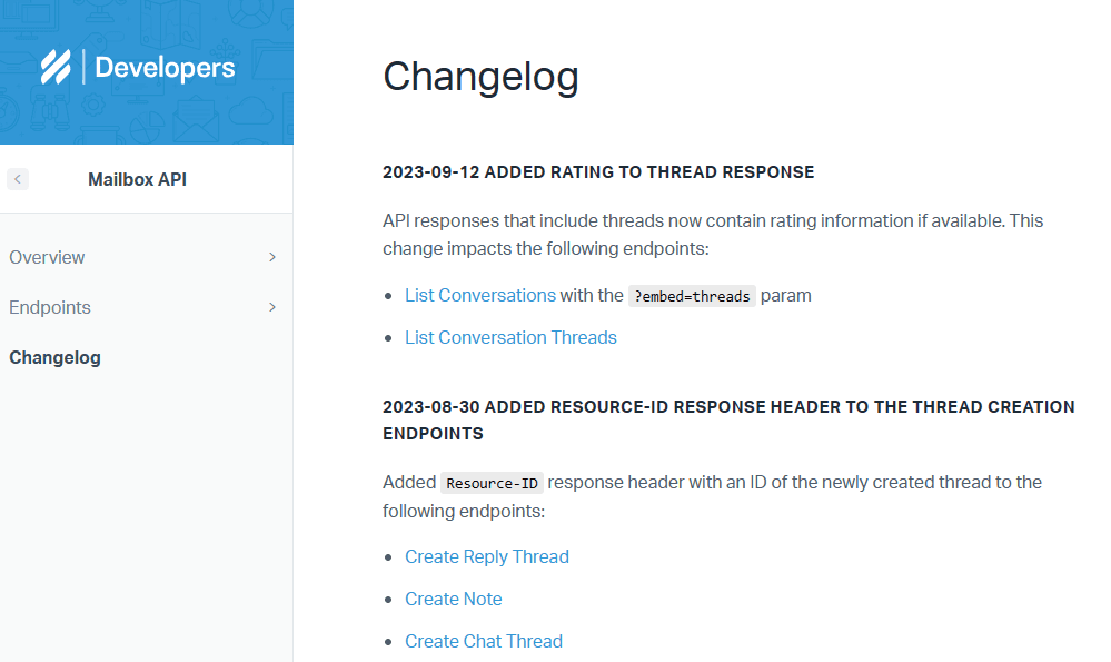
14. Help Scout
Help Scout maintains separate changelogs for different products, and their Mailbox API changelog is one of the clearest examples of developer-audience communication we've seen. Entries are structured as bullet point lists, each item linking directly to the relevant endpoint documentation or support article. There are no images, no narrative paragraphs, and no marketing copy.
The content is relentlessly goal-oriented: each bullet describes something a developer can do with the API, not just something that technically changed. This framing is subtle but meaningful, it helps developers immediately assess whether a change is relevant to their integration.
What you can learn from this example
When writing for developers, link aggressively to documentation. Every time you mention an endpoint, link to it. Every time you describe a new parameter, link to the schema. Developers will often arrive at your changelog specifically looking for a change that affected something they built, so make it as easy as possible for them to jump directly to the relevant documentation.
If your product has different user personas (end users and developers, for example), consider maintaining separate changelogs for each rather than trying to combine them. A developer looking for API changes has very different needs than an end user looking for new features in the dashboard, and trying to serve both in the same feed often serves neither well.
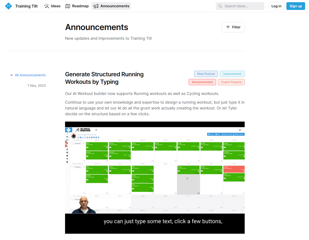
15. Training Tilt
Training Tilt is a business management platform for fitness and lifestyle coaches. Their changelog, which is built with Frill, demonstrates what a well-rounded product communication strategy looks like in practice.
Their entry titles are goal-oriented and specific. Rather than "AI workout generator" (which tells you what the feature is), they use "Generate Structured Running Workouts by Typing" (which tells you what you can achieve). This distinction reflects a deep understanding of their audience: coaches who think in terms of client outcomes, not software capabilities.
Each significant update includes a short tutorial video, not a polished marketing production, but a practical walkthrough showing exactly how to use the feature. Users can watch the video and immediately understand what changed and how to apply it. The changelog doubles as onboarding documentation for new capabilities.
View Training Tilt's changelog.
What you can learn from this example
Goal-oriented titles are one of the highest-ROI investments you can make in your changelog. Revisit your last five entries and rewrite the titles to lead with what the user can now do. You'll see the difference in engagement.
Short tutorial videos, embedded directly in changelog entries, eliminate the gap between announcement and adoption. Users who watch a two-minute walkthrough are dramatically more likely to try a new feature than users who only read about it. Immediately after watching the video, they should be able to understand how to use the feature.
Use a changelog software like Frill that gives you category tags, easy publishing, video embeds, single sign-on for users, and other key features inside a full product communication suite that's complete with feedback and roadmaps.
FAQs about writing changelogs
We've got answers to your frequently asked questions about changelogs.
What is a changelog used for?
A changelog is a document that provides a chronological record of changes made to a software application or system, whether through single-topic entries or monthly round-ups. It serves several purposes: communication with users, essential documentation, and product transparency. A well-maintained changelog reduces churn, drives feature adoption, and builds the kind of trust that keeps users around long-term.
What do you write in a changelog?
In your changelog, you should include the product version number (if your company chooses to share it publicly), the date of the changes, sections for new features, improvements, and fixes, concise descriptions for all changes, and links to relevant and helpful resources. Always highlight how product changes impact the user and what they can achieve with these updates, whether that's completing additional tasks or surfacing advanced analytics.
How do you cater your changelog to users?
Use plain language and group updates logically, or write one changelog entry per update. Always highlight how product changes impact the user. If you're writing for a technical audience, you might include additional engineering or security details to show your user base that you're utilizing best practices. If you're writing for non-technical users, strip the jargon and lead with outcomes.
How do you create a changelog?
To set up a changelog for your software, create a dedicated hub that's separate from your marketing blog. Your product management team should have access to this hub so they can publish entries without needing help from the marketing or web design team. Use one of these low-cost changelog tools to create your hub. For best results, use a platform that includes a changelog, user feedback, and your public product roadmap all in one place, so users can not only see updates but also request new features and review upcoming ones.
Who is responsible for creating changelog entries?
At smaller software companies, product managers typically write the changelog on a monthly basis or for important product updates. At larger companies, a technical writer usually creates the content with heavy input from product managers and engineers (especially for bug fixes). Whoever owns it, the key is establishing a clear publishing cadence and making it easy to write and publish entries quickly without bottlenecks.
How can you increase changelog reads?
The vast majority of users will not seek out your changelog on their own. You need to drive traffic to it. The most effective tactic is a changelog widget embedded directly in your app. It surfaces updates where users are already active. Beyond that, promote important entries via targeted email notifications, link to individual entries from relevant in-app tooltips or onboarding flows, and share major updates on social media. The changelog is a starting point for distribution, not the entire strategy.
9 best practices when writing changelogs
Ready to create your own changelog inspired by these examples?
Use these best practices as a checklist to create an effective changelog:
Choose the right changelog software: Consider tools that offer changelog features like in-app announcement widgets, single sign-on for users, and video embeds. Choose a platform with changelogs, feedback, and roadmaps in one place.
Engage users with emoji reactions: Use emoji reactions to track the popularity of updates and understand user preferences.
Tie announcements to feedback requests: Link changelog entries to direct pieces of feedback or requests from customers. Demonstrate that you value customer input by connecting updates to user suggestions.
Utilize widgets for accessibility: Implement a widget for quick and easy access to your changelog directly on your website or web app. Enhance the user experience by allowing them to stay engaged without navigating away from the current page or feature they're on.
Publish frequently: Regularly update your changelog to communicate that your product is continuously maintained. You should publish at least one entry every month.
Write descriptive, actionable titles: Use actionable language to showcase the importance of each update. If using a monthly round-up format, make them highly skimmable with bold and descriptive titles.
Add tags: Use tags to distinguish between types of changelog entries (improvement, feature update, etc.). Enable users to sort entries based on their interests and preferences.
Include Visual Elements: Incorporate GIFs, images, videos, or other visual elements to make your changelog more engaging and easy for users to understand (without having to read the full text).
Only use technical language for technical audiences: Tailor your changelog entries to your audience, using concise language. Keep entries short and to the point. Only provide technical details if your audience cares about them or needs to know them.
Managing a changelog is all about catering to your users. What do your users care about? Use that knowledge to create a changelog that is perfectly formatted, both in terms of design and the writing style.
Looking for a better way to manage your changelog, user feedback, and roadmap? Check out Frill.

Dayana Mayfield
Dayana Mayfield is a B2B SaaS copywriter who believes in the power of content marketing and a good smoothie. She lives in Northern California.